A brand to Grow
UNVEILING THE NEW IDENTITY
This is the story told in a different way – in other words, a new version of the story – of an ongoing passion for the food industry.
Focus on growth
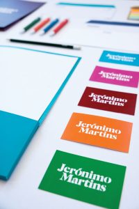
An identity that conveys the Group’s focus on the future and on growth, through the graphic design of the leaf in the letter “O”.
A world of colour
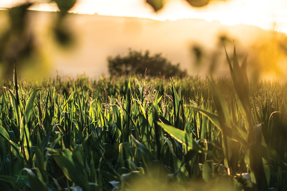
Inspired by the passage of time: from the lightness and warmth of dawn through the brightness of noon to the richness of dusk, mirroring the day-to-day of Jerónimo Martins’ customers and growers.

Heritage meets modernity
A strong and distinctive typography that balances both the Group’s legacy and its vision for the future.
THE PREVIOUS LOGO
A symbol to convey
Cohesion, order, dynamism
A “financial” brand
Developed with the financial markets in mind
“The previous identity was designed in 2003, when the Group’s reality was very different from what it is today.”
Sara Miranda
Jerónimo Martins’ Chief Corporate Comunications and Responsibility Officer
A BRAND NEW GROWTH-DRIVEN BRAND
When the new visual identity of Jerónimo Martins was launched, it was quite hard not to notice that the Group’s logo had changed, as it was almost everywhere. In Portugal, it was there when you turned on the radio, when you went online, when you opened a newspaper or even when you went to a cashpoint to withdraw some money. It was everywhere because it plays a huge part in the daily lives of millions of consumers. The new corporate identity was unveiled on September 27, during the official inauguration of the Group’s largest single investment in Portugal – the 75 million-euro Logistics Center in Valongo, North of Portugal.
Sara Miranda, Chief Corporate Comunications and Responsibility Officer, shared the two main reasons for this change: “The previous identity was designed in 2003, when the Group’s reality was very different from what it is today. Fourteen years on, we are a multinational Group, focused on the food business and determined to continue to grow. Our visual identity no longer reflected our brand’s reality. Celebrating 225 years was the perfect time for a change”.
By the time the previous identity was created, Jerónimo Martins Group had just overcome the biggest debt crisis in its 225-year-long history. Back then, Jerónimo Martins was a Portuguese brand at an early stage of its internationalisation experience. Poland only corresponded to 15% of the Group’s EBITDA and it took another 10 years for the first stores in Colombia to open. Therefore, the new image was intended to mark that achievement in a symbolic way.
Having existed for more than two decades in the Portuguese and Polish markets, in 2013, Jerónimo Martins established operations in Colombia under the brand Ara. The Colombian national expansion plan is paving the road for the Group to continue consolidating itself as a global benchmark player in the food retail sector and prepare its future growth engine.
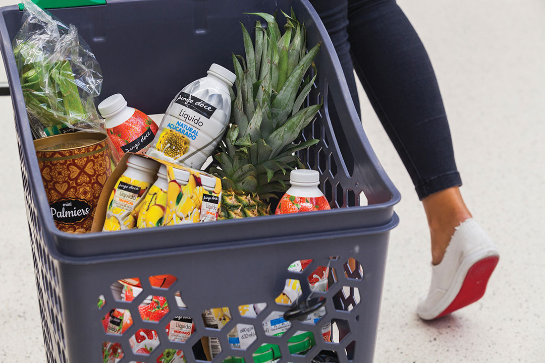
Every day, millions of consumers in Portugal, Colombia and Poland bring fresh, locally grown produce into their kitchens from the more than 3,500 food distribution stores of the Jerónimo Martins Group.
This new reality asked for a new language, one that could highlight both Jerónimo Martins’ heritage and the idea of growth which lies at the very core of the Group. A language whose colours were inspired by time – from the lightness and warmth of dawn through the brightness of noon to the richness of dusk, mirroring the day-to-day of Jerónimo Martins’ customers and growers. A logotype that would give a vibrant picture of the world of food, people and places that have been at the heart of its business for 225 years.
“There’s a balance between heritage and modernity in the new logotype, which can work across everything. It’s like a window on the world, and every time you look through the window, it’s a different view through there.”
Nick Eagleton
Creative Director of The Partners
THE REBRANDING PROCESS
Four agencies were invited to submit proposals for the rebranding project – two in Portugal and two in England – under the requirement of never having worked with a Jerónimo Martins banners. The choice fell on English agency The Partners, as its proposal was the one which best found a balance between tradition and modernity, past and future.“We didn’t know Jerónimo Martins before we started this”, says Nick Eagleton, Creative Director at The Partners, in an interview with Feed.
NICK EAGLETON
Nick Eagleton is UK Creative Director at The Partners. In his 17 years in the London studio, Nick has worked on every possible facet of brand communication, across a huge range of clients and industries from global brands to start-ups. Over this time, he has created award-winning work for clients as diverse as Ford, BBC and Deloitte. Alongside his ongoing work with this multinational consulting company, Nick is currently leading the agency’s creative work for Shakespeare’s Globe, Newton Investment Management and Jerónimo Martins.
“We were told the story of a company whose roots lied 225 years ago, with an entrepreneur who opens a store, a company that has its roots in the community, that believes in people, that believes in bringing food to people and that spirit is growing around the world. And when we know how ready a company is to change, that’s a gift to us and that’s a gift for the team.”
Thus, that “story of constantly moving forward and bravery”, along with the aim of democratising food, turned out to be the real brief: “our creative brief, if you like, was right there in front of us. So, the objectives were clear from the very beginning”, he adds. The British Creative Director admits that, unusually, all that came easily together: “Sometimes, it’s really hard when you got to go into hundreds of versions, there’s lots of difficulties along the way, but this… the old/new balance, the idea of creating something with heritage but expressed in a new way… with the logo happened naturally.”
“The variety of images and the variety of colours express that every day is a new day and every day feels fresh. Just like this identity can be.”
Nick Eagleton
Creative Director of The Partners
THE PARTNERS
Founded in 1983 and part of the WPP network, The Partners creates, cultivates and inspires brands for those who aspire to lead. Turning strategies and ambitions into creative actions, the agency builds brands that continuously evolve and grow stronger over time.
They’re 80 people in London, New York and Singapore, proud to have been one of the world’s most consistently awarded brand consultancies over the last 30 years, and the most awarded brand consultancy at Cannes. For them, a successful brand is the result of continuous collaboration in which intelligent advice and inspiring ideas must be delivered every day.
Eventually, the feeling we get when we look at it is the inspiration itself, based on the freshness sensed in the Group stores’ produce: “The variety of images and the variety of colours express that every day is a new day, and every day feels fresh. Just like this identity can be different tomorrow – in the story it tells – from what it was today”, he observes.
“It’s like a window on the world, and every time you look through the window, it’s a different view through there.” Moreover, the rich family of typefaces “embraces the cultural diversity of the multinational business, giving it room to grow, literally, when the brand expands across the world”.
The purpose of expressing growth is also hidden in the smallest details, as Nick explains: “I did a little twist, looking for, rather than create a separate symbol… let’s weave the idea of growth, which is at the heart of everything, into the logo, and the accent (on the O in Jerónimo) was the perfect place. And so, in the logo, the leaf of growth, perhaps one of the smallest details in the whole word, it’s the biggest picture.”
The award-winning brand designer confesses that this was one of the most rewarding and beautiful projects he has worked on in a long time, since there was something about the people, the culture, the project. “Something about this gap between amazing brand/not amazing identity” that was perfect for The Partners as a creative challenge: “It’s been a project with real heart to it.” That’s why he and his team couldn’t be more proud of their job: “When I saw that on the building, that was the first time I saw it in the real world. It felt like it’s always been there. It somehow feels that it was meant to be like that. That doesn’t always happen.”
light and shades of colours that we can see in nature throughout the day.
CAN BRANDS CHANGE THE WORLD?
From Nick’s point of view, unlike many companies, Jerónimo Martins can claim to have a desire to constantly push forward, a desire to put people at the heart of that, having never lost sight of what they believe in. So, when asked if brands like this can change the world for the better, once again the London-based agency’s Creative Director spared no compliments to the Group.
“The story and the beliefs and the values are powerful and they’re a force for good in the world and I say that in all genuineness. And telling that story through a brand identity matters to people because people want to know that there are those companies, big, successful, international companies, who are doing that because they believe in things that are fundamental for people. And I’d say, in their own way, those brands do change the world. If you don’t have those values, you can change the world for the worse.”
Brand design is all about storytelling: “Everyone knows who you are, but they don’t know your story”, Nick recalls. We know stories are meant to be told and we know that every visual identity is meant to tell a story. Well, there are millions of ways to do it. So, this is the story, told in a different way – in other words, a new version of the story – of an ongoing passion for the food industry. A story rooted in the Jerónimo Martins Group’s untouched essence: a spirit of purposeful and growth-driven enterprise which has remained unaltered for generations but, at the same time, it’s also a story pointed to the challenges and achievements still to come. The result is an inspiring brand with humanity, personality and adaptability that will carry its story, its business and its consumers into the future.
Let’s g(r)o(w)!