Shine On
“We wanted to tell the city’s visual story using business signs, so we started taking photos of the signs that were still up in downtown Lisbon. We’d go every other week. Then, we realised that the signs were disappearing and felt an urgent need to rescue them before they were tossed out”, said Paulo Barata. He and Rita Múrias – who, in addition to being his partner on this project, is his wife – decided, from that moment on, that whenever they came upon a decommissioned sign or one from a store that was about to close, they would do what they could to save it from the same fate.
And, thus, began the collection which now includes over one hundred and fifty specimens: “We have about 150. 80% are neon signs, but we also have shutters, reverse glass signs, metal letters, light boxes…”, says Rita. Among them is the iconic Ritz hotel sign: “It’s the actual original, created at Pardal Monteiro’s studio in 1959”, she emphasises. “They decided to change it because it was damaged.” The signs were on display in the temporary exhibition “Graphic City”, as a result of a partnership with MUDE – Design and Fashion Museum, within the framework of the project “Letreiro Galeria” (meaning “Gallery Sign”), and are now stored in a warehouse waiting for backers to help fund the creation of an exhibition space where everyone can “enjoy this visual memory”; much like at the Buchstabenmuseum in Berlin, the first of its kind in Europe.

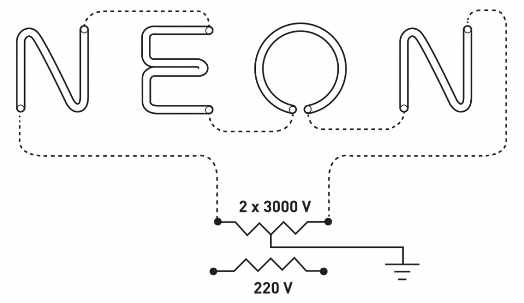
RELIGHTING THE NEON GLORY
With the debut of neon in the early 1940s, Lisbon sought to reclaim its status as a metropolis and, in a way, it did – if not in essence, at least in appearance. The magical glass tubes shone brightly across half a century and the designers still got to see them in all their glory during their early childhood and adolescence, which lit the fuse that ultimately fuelled their project: “In the beginning of the 20th Century, Rossio was a flurry of gas lighting and by the 50s neon lights were flooding the streets,” says Paulo.
“All of a sudden, there was a festival of light, with the carriages on carousels seemingly moving and horses appearing to be trotting about, the Ovomaltine straw sipping milk… Those who didn’t live in Lisbon and came to visit were left in awe. People would flock to the city just to see the lights.” Rita states: “As a child, I would love going to see the Christmas lights in the city with my parents. And, when it was raining, I used to love seeing the reflection of the neon lights on the street because it had an iridescent effect and would fill everything with colour. It’s a childhood memory I’ll never forget.”
“All of a sudden, there was a festival of light, with the carriages on carousels seemingly moving and horses appearing to be trotting.”
PAULO BARATA
At the time, a bright sign was in itself an indication of the success of any business. Success was often measured by the technological boldness and extravagance of the pieces which were akin to unique works of art that bestowed a typographic identity on the city. Haphazard and “gaudy”, but, nonetheless, an identity and full of charm: “In Portugal, we don’t have much of a tradition when it comes to good typographic design or calligraphy. When design was autonomous, spacing wasn’t done very well, and lettering was a bit exaggerated. When lettering manuals were followed, things were different.
Today, we have more resources and lettering is designed properly, but one can see in the finishes, in the light boxes with the names of banks and of restaurant chains that we’re losing the urban typographic identity that was once cherished. Logos are the same here, in Braga and in London,” explains Rita. LED has replaced neon, which is slowly disappearing in a century lit up by other lighting, from a globalised world, making a comeback impossible. This is something the designers accept quite naturally, as their commitment is to the past.
On a stroll through the streets of downtown Lisbon, reminiscing about the heyday of the technological innovation, it’s easy to spot signs above stores they don’t belong to. Stores which have replaced those for which the signs were designed. But there are also establishments that have incorporated them as decorative elements, such as Pub Lisboeta. Interestingly enough, many refer to it as Pub Lucilia because of its bright orange sign, which once adorned the walls of a beauty salon.
“One day, Lucilia’s granddaughter came by and was quite moved because she recalled seeing the sign in her grandmother’s salon,” says Paulo. For Rita, hearing these stories usually leaves her with “mixed feelings” as the joy she gets from finding the signs is dampened by the sadness store owners express when they see the artisanal works of art that once stood as a testament to their success taken down. However, if history is anything to go by, the real light, the one that has shone brightly for generation upon generation, the light in the stories yet to be discovered and told, will never go out.
NEON STORIES

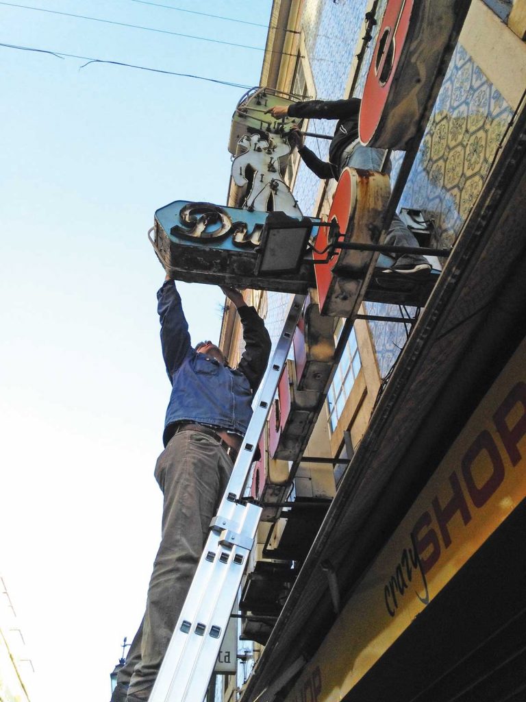

Durbel: Former bag store on Rua da Prata, in Lisbon. When a neon sign is taken down, first the glass neon tubes are removed and then the metal sheet is disassembled.
WAITING FOR FREEDOM TO SHINE
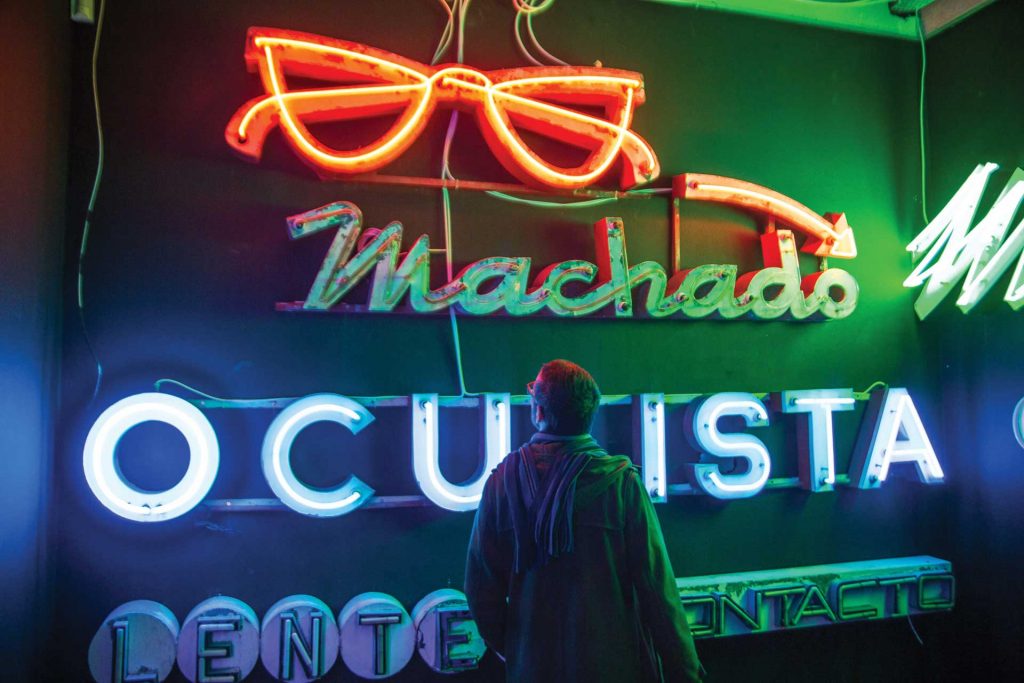
“I once went to a warehouse that belonged to a man who worked for a lighting and signage company. And when he saw the sign for the optician Oculista Machado, he made quite the fuss. On 25 April 1974 – on the same day the Revolution ended dictatorship in Portugal and marked the beginning of the country’s transition to democracy – he was sat on top of the sign, fixing it, and someone told him that a huge revolution was afoot and that he had to come down, that a curfew had been imposed”, tells Rita Múrias.
FOR THE SAKE OF HISTORY
There was an optician on Rua da Prata that had a store in a stairwell, which is becoming rarer in the city nowadays. The owner started working in the store when he was 12. He was an apprentice for two years and spent his entire life working there. Then, the original owner, his mentor, passed away. The daughter gifted the store to the apprentice and he changed the sign to have his name on it, which is followed by ‘Formerly owned by master such and such’, the former owner… In the meantime, the man also died, and the lady who managed the store for another 15 years then decided it was time to close a store that had been around for 70 years.
THE RIVER CONTINUES TO GLEAM
The restaurant Brilha Rio closed and it stayed inside. “I spoke with the man and explained our project to him. He didn’t want to give me the sign, but he also didn’t know what to do with it. A year later, he suddenly called and told us to pick up the sign the next day. We were preparing the ‘Cidade Gráfica’ exhibition with MUDE at the time, and the sign was put on display. The gentleman had been ill for some time and, when he learned about the exhibition, I called him and he went with his family. It was a surprise for him to see that the sign had been transformed into an industrial design piece, with his story”, Rita recalls. The sign that had been decommissioned was shining brightly once again.